Sunday, 28 April 2013

Evaluation Activity 2

How effective is the combination of your main product and ancillary texts?


Overall i believe that the three final products myself and Sidney had put together all worked very well as a combination. As our target audience is around 18+ and more targeted towards males, our main protagonist in the film is also male as it will able the audience to put themselves in the same situation during the film, hopefully adding a greater element of horror. Also after having a main character in our trailer being the main focus point it was key that we incorporated it into our other texts, the poster and magazine cover. Which is shown by the key picture on the magazine cover being an actual shot from our trailer (Seen in the two pictures below), meaning that when members of the audience see it, this will automatically make them think of this certain film after seeing the trailer. Which in return will hopefully create a high level of interest and audience following before the film is released.


Another thing that works well as a combination is the fact that our teaser trailer gives very little of the storyline away, however it shows enough action and clips to have the genre clear and hopefully make people want to see our film. That along with the poster and magazine cover again create a sense of anticipation about our film. Making the audience want to see more of the action and become involved with the storyline, so inside the magazine we allude to a tour round the setting of our film. The house which is one of the first things the audience see in our trailer has great importance. So using this in combination with the teaser trailer and how the audience could relate to our main character (though the male gaze theory) would work well as an advertisement in grabbing our target audiences attention and getting them involved with the film.

Carrying on from the way our teaser trailer gives little of the storyline away, we used this intentionally to create more of an interest and following inside the target audience. As the introduction of a website appears on our film poster this would be used as an extra part of our advertisement in order to gain a greater relationship between the audience and our film/characters. On the website there would be exclusive information which would reveal more of the storyline as we get closer to the release date. So with use of the combination of our trailer and poster this should increase the advertising campaign, and gain us a close following based on our target audience.

Also another focus of our three media text were to keep a similar colour scheme, consisting of the traditional horror colours of black, red and at time white as it gives a paranormal feel (Shown in the pictures below), this was evident in the titles used for our trailer, some of the shots and many aspects of our magazine cover and poster. This abled us to have a link between all the three products and hopefully allows members of the audience whom haven't followed our advertising campaign as much as our main target audience to instantly recognise the genre of the film.



Overall I believe that the use of the three media texts as a combination works very well in trying to achieve a close following and large members of our target audience to want to see our film when it is finally released. They also link well together as they share the same colour scheme throughout and many of the same pictures allowing the audience to relate them altogether

Evaluation Activity 3 - What have you learned from your audience feedback?


The filmed audience feedback has given us the opportunity to hear the pros and cons of our film. This is very helpful to us as we can work with these views and bear them in mind in any future projects.This is the feedback the audience gave.

Pros:
  • The use of short shots and jump cuts paired with the heart beat kept the tension going, having an impact on the viewer.
  • The change in camera angles, the combination of both handheld camera shots, which allowed Point Of View shots and positioned camera shots.
  • The mixture of the heart beat and the shots made it "work really well"
Cons:
  • The transitions of the first bits of music cut out too abruptly and just stops dead.
  •  We could have given a bit more of the plot away.
Other comments:
  • It doesn't give too much away so it's typical of a teaser trailer.
  • The titles give information on who the film's made by and who's staring in the film which is effective as it lets the audience know that well-known actors star.

The feedback has taught us a lot as a group and we now feel we have a better idea on how to create an effective trailer. Some of the comments were interesting as we had contrasted opinions between the audience, one member said we could have given more of the plot away whereas another said how not giving too much away was typical of a teaser trailer. We feel that being a teaser trailer there is a fine line between giving too much and too little away, and we didn't want to cross over the line but we could have afforded to show a little more as the trailer was slightly ambiguous. From the feedback we learned that our choice in the  music and sound to add was good but our idea of transitions was not, looking back on it the transitions is far too sharp and sudden, if we were to do it again we would make the transition smoother. We are happy with the titles we added although we feel that adding more could be even more effective. It was nice to hear the strengths of our trailer and it taught us just how effective good sound effects mixed with suitable footage can be, should we do it again we would use more sound effects over clips.

evaluation activity 4

Evaluation Activity 4

How did you use new media technologies in the construction and research and planning stage and evaluation stage?


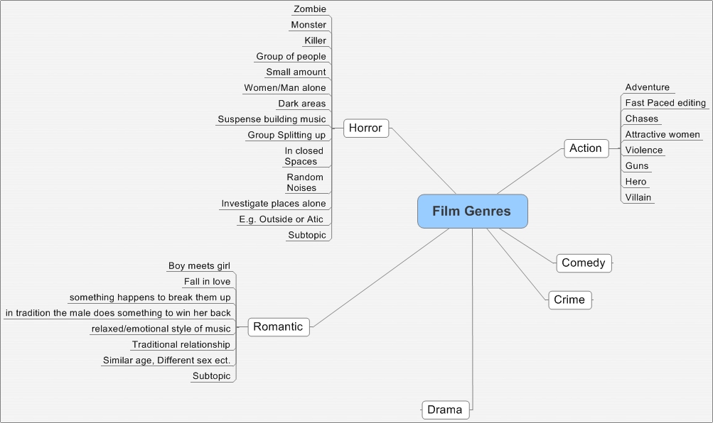
The part of research and planning we did for our trailer was so decide on the genre and have a small idea what the storyline would consist of. We used a number of Microsoft programmes which allowed us to make a lift of the different genres and their clichés. After making the list we then narrowed our ideas down and had a new ideas for a trailer in either a horror genre or action. We then again made a mind map of this genres along we the ideas consisting of the advantages and disadvantages, as well as any problems we could encounter whilst making the trailer.


Before coming to a conclusion we then used a combination of blogger to upload and organise the ideas we have. Along with YouTube which allowed us analyse other trailers, helping us make a final decision and giving us a few ideas with storyline, camera angles and editing. We had used this throughout the foundation and advanced courses of media, and they have been very helpful as blogger allows us the present our work and track our progress very easily. Where as YouTube allows us to look at other films of a similar genre, aiding our research and planning.


After some analysis of other film trailers on YouTube we then came up with about three final ideas for a film trailer. We went though a similar procedure in making mind maps of strengths and weaknesses of the various ideas. We outlined some of the difficulties we could have, but also some of the things we could do very well

Once we made the decision to make a horror film we came up with an outline of the plot. We drew up a storyboard based on the ideas we had. Once this was done we were then able to take pictures of each individual part and upload it to windows movie maker in order to create an animatic. Which now at the evaluation stage has shown us how our work has progressed since the beginning.

Another idea we had was to create the mood board using prezi, this again was very helpful as it allowed us the create the mood board showing different aspects of the horror genre in a number of ways, mainly though pictures. However once it was made on prezi it was easy to move to the blog, organise and make us of it when it came to filming.


Once we were comfortable with the research and planning we then began filming. We used the cameras the school provided for most of the shots along with the tripod to keep the shots steady. As we had been using the camera for the last year or so we found it easy to use, and then upload to a computer to begin the editing process.


We used Adobe Premier Elements to edit our footage, like the camera a tripod as we have used this software before we were very familiar with it. This allowed us to add it information about our institutions, use specific transitions at suit to the horror genre and add two pieces of sound/music at the right time.

Once the editing was complete we then moved onto the film poster and magazine front cover, which we put together on Photoshop. Photoshop as a media technology was fairly new to us both, however after spending time on it we quickly adapted and were able to create the items we needed in order for all three of our products to fit together.


 Lastly we other media technologies we used where social network sights, these were used to speak to our target audience and help us gain answers to our questionnaires, which we needed to understand more about what the audience would expect from a horror film trailer.

Our final piece, fully edited and corrected

We changed multiple things compared to our previous pice, we added a scene of a door slamming and also added a fade-out to some of teh music so it doesn't stop so abruptly.

Final Film Poster


We made several changes to out original poster to come up with the final. We enlarged the image of the eye to fill up most of the poster but didn't fill the whole poster as we felt it was more effective to leave certain bits with a black background as it makes those bits easier top see and read. Having the image behind text is more effective than having one on side because it draws the audience's attention more effetively to the poster and the title. We also changed the font of the title as the previous one didn't look dark enough, it looked to much like a red you would see in noddy, not in a horror film.

Audience profiling - statistics

This image clearly and effectively show useful facts and figures about the attendance to Paranormal activity. It shows that although the majority of the audience were male, this was the case only slightly which is not a common in horror films as it is quite strongly male dominated. The reason behind how close they were could be due to the certificate and the style of the movie. Being a 15 it could attract a large number of teenage couples and is unlikely to show really gory scenes which are rarely celebrated by the female audience, as well as this the film soon became 'THE' thing to see due to how jumpy the film is and how the audience reactions really input on the ambiance of the screening. Although it was a scary film, it was a fun scary, people went in knowing they would come out scared but knowing they had a blast. With our film being very similar to Paranormal Activity in both content, story and theme we are drawn to a 15 rating, but despite this, a horror film could be more likely to attract horror fans if it is an 18. We had to weigh up between a certificate that allows a wider audience to view it, or a smaller audience but a more attractive film to the general horror audience. The class % is very interesting as it shows that the smallest % of the audience was C2 which is skilled manual workers. A possible reason behind this could be the social class of the characters in the film, poorer people may not want to watch a film about those better off than them, although this is unlikely as a high percentage of those that viewed the film were in the D and E classes which is lower than C2. Another reason may be this; the stereotypical manual worker could likely be a builder or mechanic, both of which we would assume are male and also fairly macho, they are unlikely to get scared by young men or women being at risk because it's not someone they can relate to.This could explain why D and E class % was so high because semi and unskilled manual workers (D class) are likely to be young men/teenagers so they are threatened

Magazine front cover